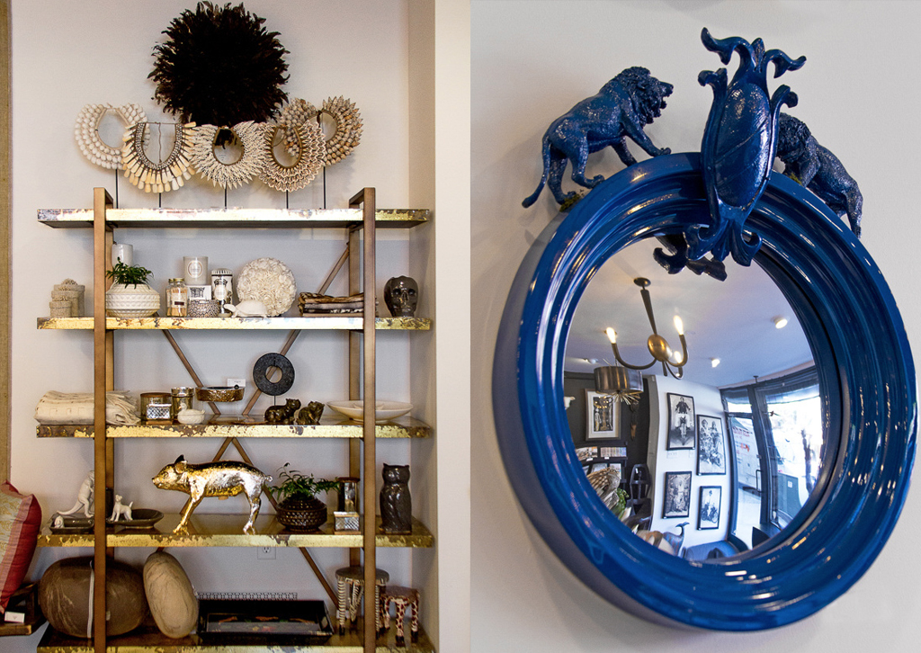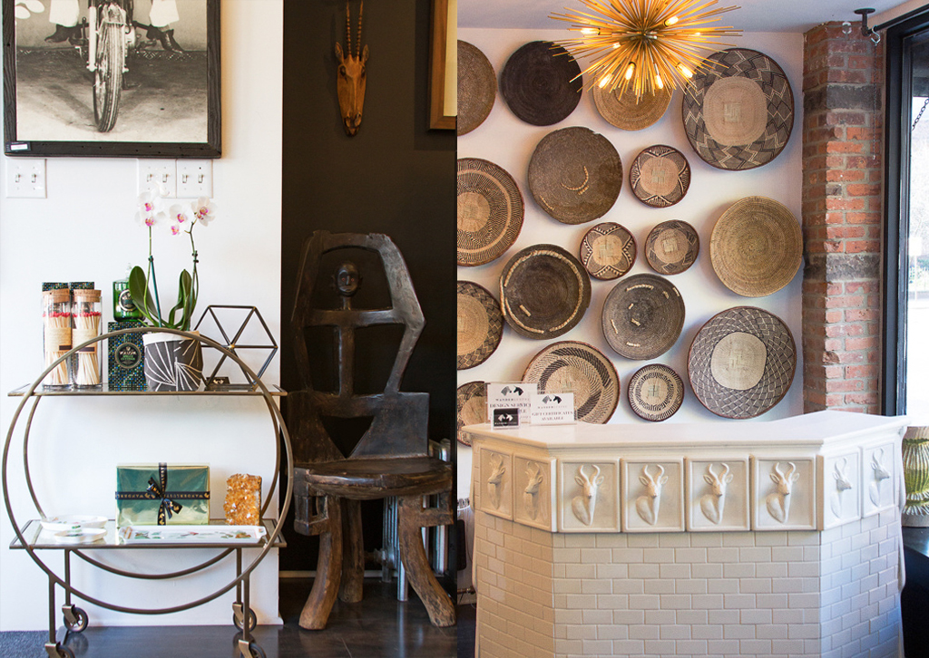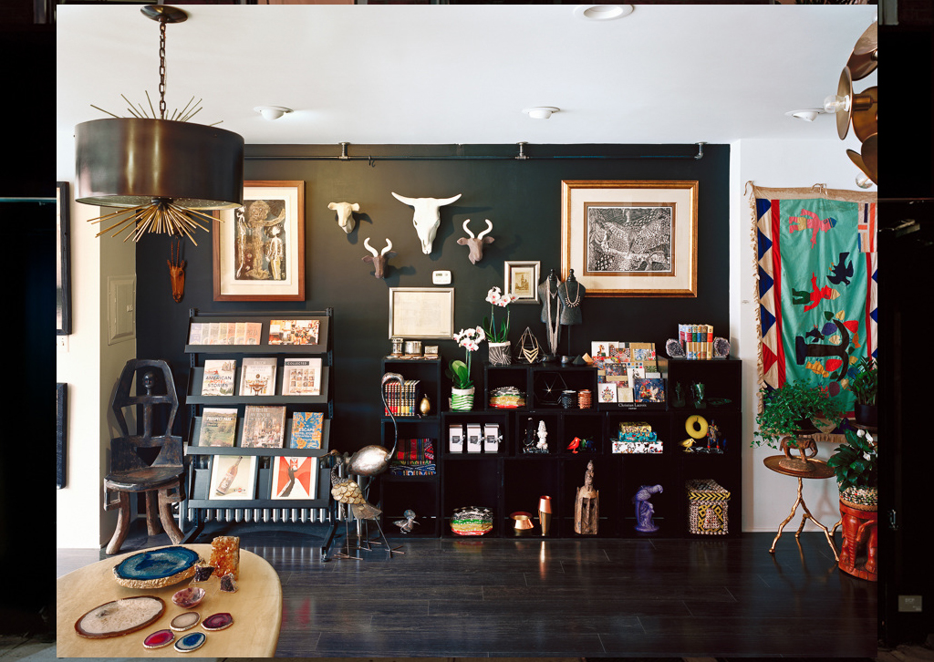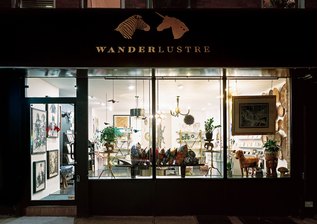
Kathryn Grogan Ivanfy, the proprietor of Wanderlustre contacted us last year to design their corporate identity and needless to say we jumped at the opportunity. We loved the whole concept of the store as it sells very quirky curated furnishing pieces in Brooklyn, New York. I love the description on their website as it sums up what they are about perfectly:
If you have an appetite for beautiful things, Wanderlustre is sure to delight.”
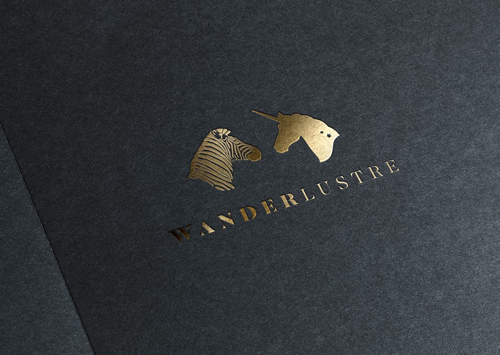
The brief was to design a logo that contrasted the dark elements of ‘Wander’ and the light sparkly side of ‘Lustre’. The result – a zebra facing a unicorn! The zebra represents the ‘wander’ and the unicorn represents ‘lustre’ – It matches the quirkiness of the store perfectly!
Have a look at their online store: wanderlustre.com
Photo Credit: Jade Doskow Photography


