Something Borrowed, Something Blue
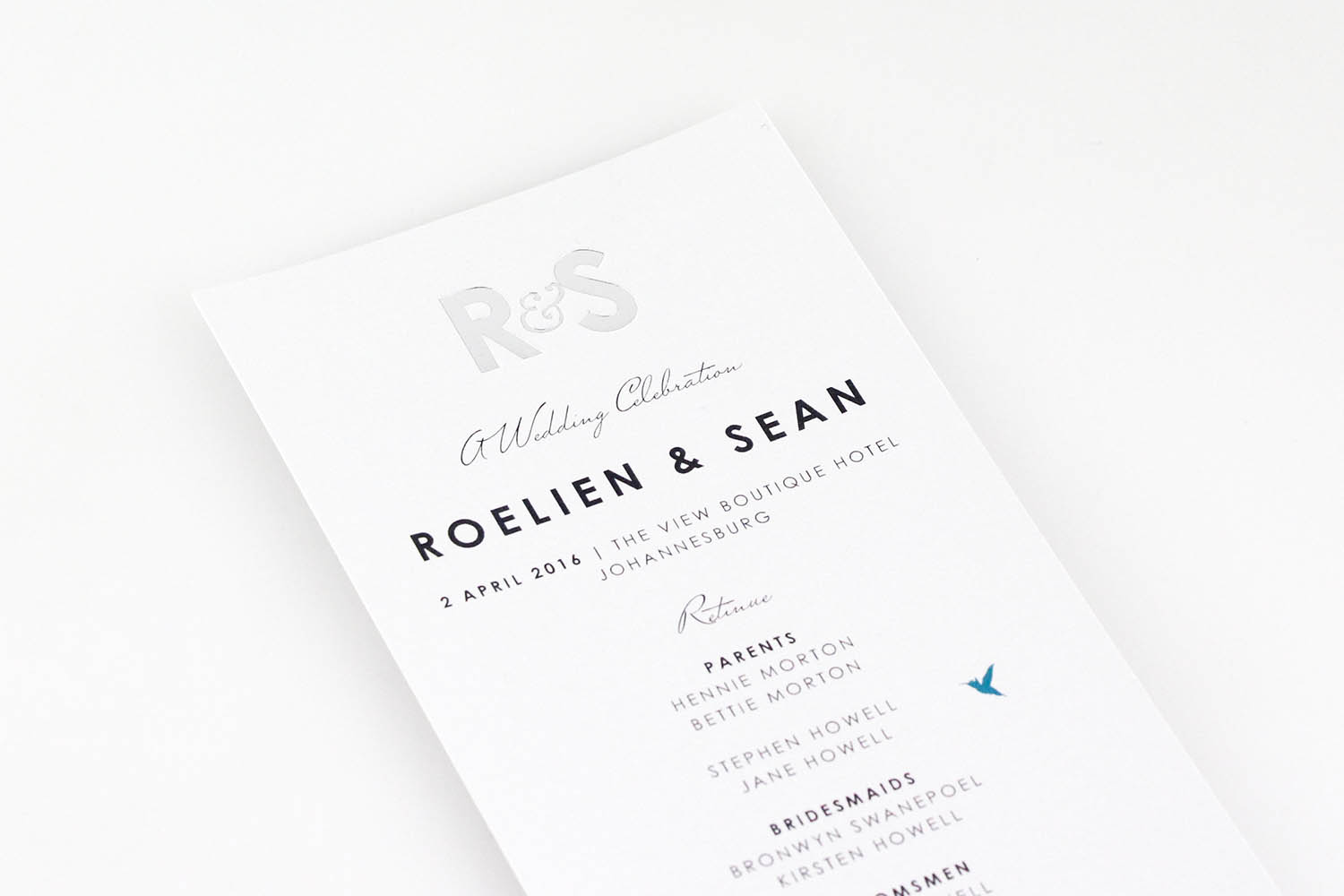
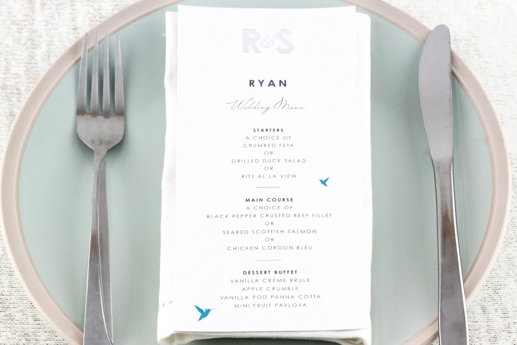
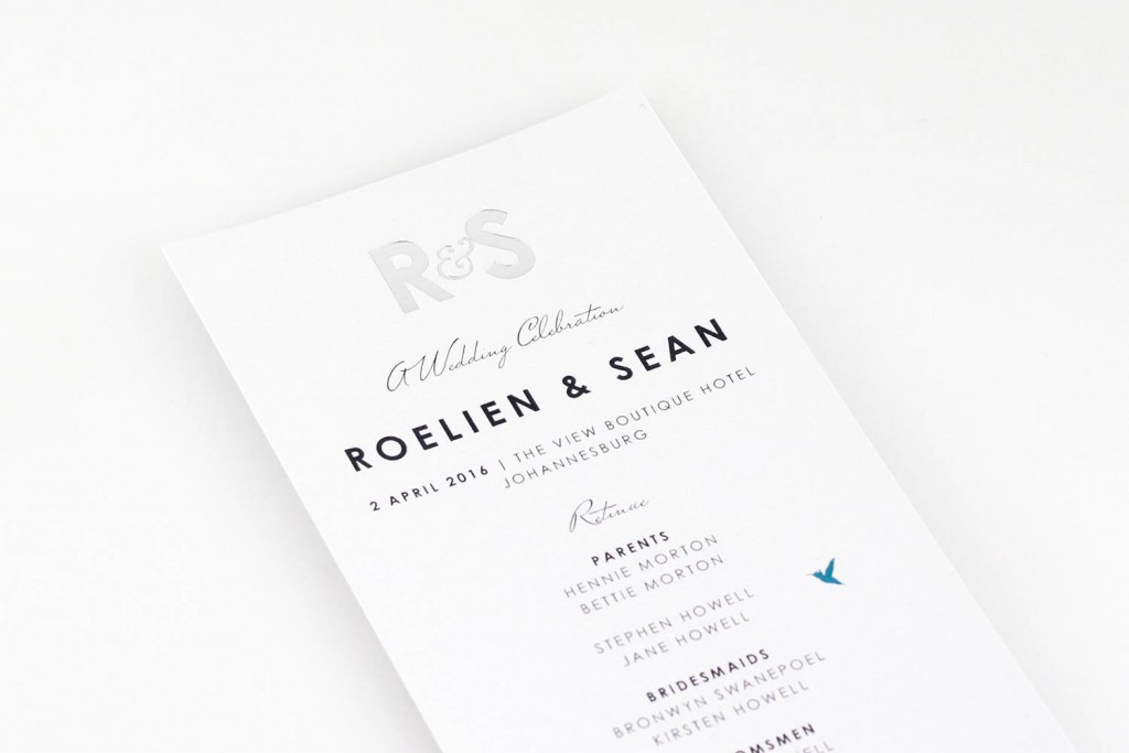
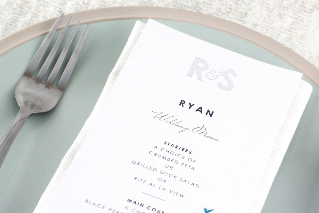
We designed modern, simple yet sophisticated stationery for Roelien & Sean’s wedding. From the seating charts, to the menus and the Order Of Service, everything tied back to their original invite that boasted a clean palette of white, blue, silver and grey. All the design elements had an underlying theme of delicate fauna and flora right throughout. Perhaps the most pleasing aspect of their wedding stationery is the fact that it creates such a clean and open environment in a world that is so often cluttered with too many colours and frills. The typography in the invite always works as bold type paired with light type to create an interesting contrast to the eye. Throughout the design elements, the eye travels smoothly through every aspect, thanks to the small visual aid of the birds, that create a consistent visual path.


