Monday Mood board No. 4 – Marble & Metallic
Sometimes it’s the simple things in life that are the most striking. No wonder minimalism has really gained so much popularity – this year less really is more.
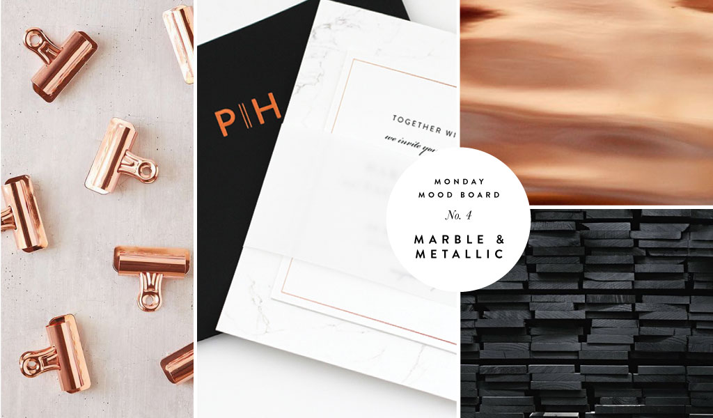
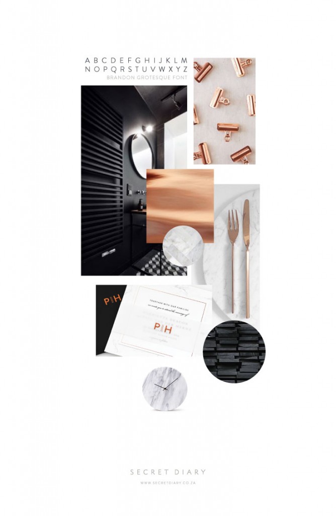
I think the trick with minimal design is getting the finish just right. Clean lines and a focus on quality, is where that perfect balance meets. The inspiration for this mood board was an invite we designed for a shoot a short while ago. The colours are neutral – black, white and grey, with just a touch of copper to glam it up. What I personally like about the invite is the use of the marble pattern. Marble has long been associated with quality and class and – when done right – marble always kicks it up a notch and makes any surface appear richer, cleaner and more opulent.
The main card comprises of two square cards (one big and one smaller), that are stuck together. The bigger card at the back is digitally printed with a beautiful marble texture and the smaller card on the front is solid white, with text digitally printed in black. The smaller card also has a digitally printed copper border, which just lends it an extra touch of elegance. The card is finished off with a translucent belly band that is stamp-foiled in copper with the couple’s initials.
The envelope is a stylish jet black, with copper foiled initials on the front and a follow-through of the marble pattern appearing on the inside flap.
Get a closer look at the Marble Muse invite here.

Image Credits:
Copper Clips | Black Bathroom | Copper Texture | Herringbone Tile | Marble Plate & Cutlery | Black Planks | Clock


